
Typography is a term used by many, but what is it? Our in-house marketing team break it down for you to understand better in the following article.
Typography is the art of arranging letters and characters, otherwise known as text. As any designer knows, typography includes typefaces and fonts; a typeface being a collection of fonts that belong to the same font family, whereas a font is a single weight or style within a font family.
There are different kinds of typefaces and other types of fonts. Typefaces differ in how they are aesthetically built (serif, sans serif and decorative), while fonts vary in weight (Thin, Medium, semi-bold), width (Compressed, Condensed) and style (Italic, Oblique).
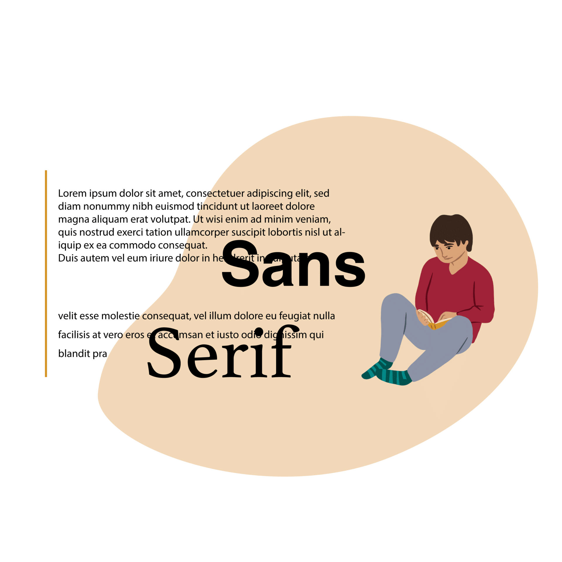
Serif typefaces are known as traditional fonts; they are characterised by the small strokes called serifs that attach to a letter’s main body. Sans serifs, which in itself means ‘without serif’, does not have these small strokes. Instead, they are more modern and are generally used for digital formats as they are easier to read on screens. Decorative typefaces come in a variety of different styles such as Script, Blackletter, Monoline etc. They are also known as display fonts and are best used for small amounts of text and in large formats, such as titles and headings.
Now that we know about fonts and typefaces, we can explore a bit further into typographical terms. There are six basic ones to know – kerning, tracking, leading, alignment and rag.
Kerning and Tracking
These two are similar and very often confused. Kerning is the space between individual characters or letters and changes throughout a word as the way different letters fit together varies.
Tracking involves the spacing between characters, so between one word and another rather than individual letters.
Leading
Leading is another way of saying line spacing and refers to the space between lines of text. It is used to increase readability and is especially important for large bodies of text. The name came from the past when lead strips were placed between lines of text depending on how much space was needed.
Alignment
Alignment refers to the way lines of text flow on a page as a whole.
Rag
The irregular margin of a block of text is called the rag. It is essential to pay attention to the silhouette and note the shape the line endings create, making sure that it goes in and out from line to line. A wrong rag is distracting, creating unwanted shapes of negative space in the margin.
Why GCS Malta?
Our team of creatives in our in-house marketing team takes the time to know each client and their business to take their campaign to the next level. With expertise in marketing, branding and design, we can aid your business in creating exceptional artworks to put your brand ahead of the competition. Contact us today for more information.