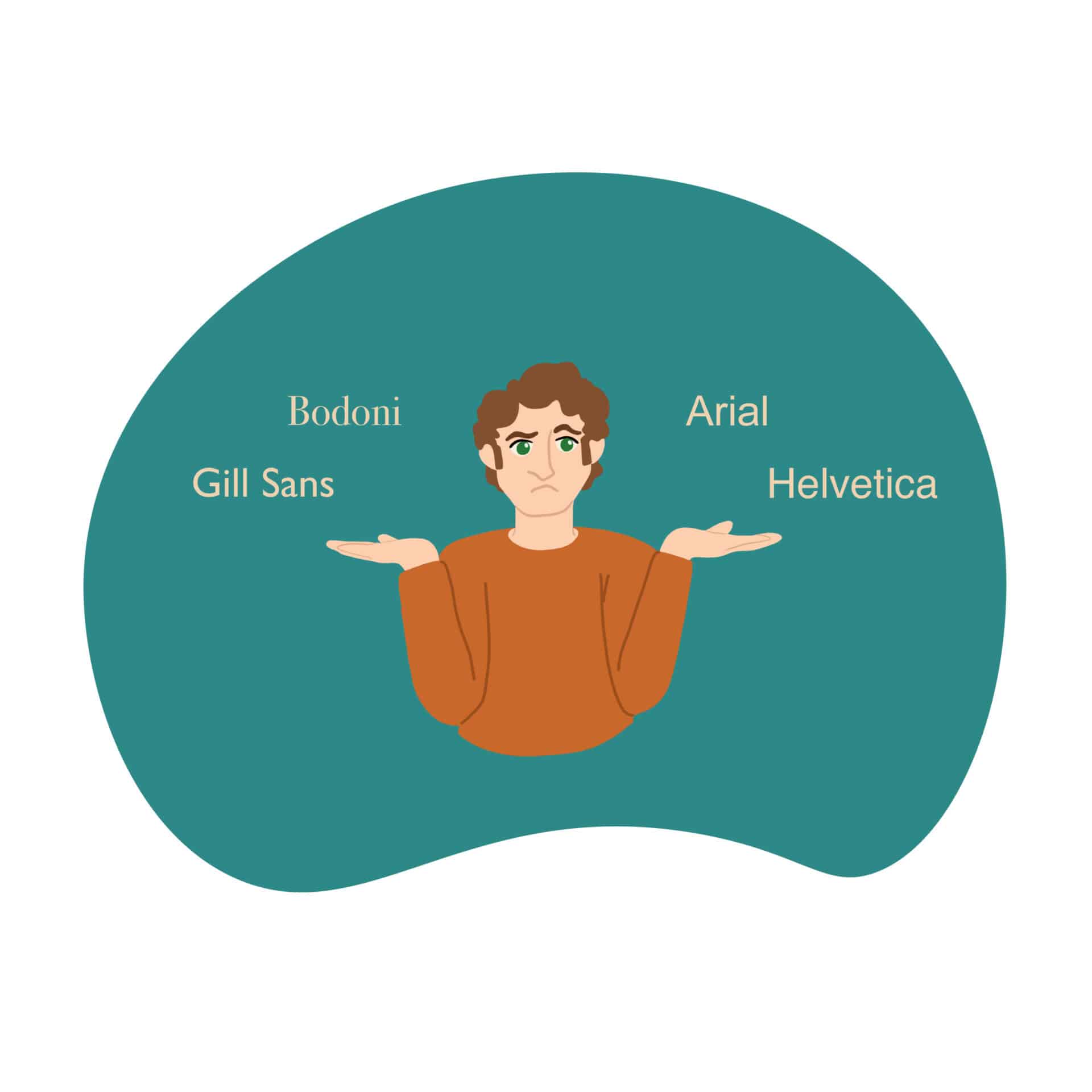

When pairing fonts, one must understand typography, particularly between a serif and a sans serif. Although Serif typefaces are traditional, their characteristic trait is the small strokes called serifs attached to the main body. Sans serifs, meaning ‘without serif’ in French, don’t have these strokes. For more information about typography, you can read our Introduction to Typography article here.
The marketing team at GCS Malta recommends the elements below to help you create some great typographic connections.
Hierarchy
Hierarchy refers to the order or properties you give to text on a page to signify importance and attention. Qualities such as size, boldness, and font-weight attract and lead the eye across the page. The essential information should stand out the most to the viewer – this could be the headline, a quoted excerpt, a warning, etc.
Context
Context refers to where the text is displayed and what the text includes, and the stylistic choices made with regards to the content. Ideally, the typefaces chosen should fit with what the text is about, also being able to be read at the size and in the medium it will be placed in. No matter the context, the text should be easily readable and clear.
Contrast
Contrast helps to map out a clear role for each font visually and gives individual attention to specific pieces of information. It can be achieved through font style, size, weight, and colour changes.
Mix serifs and sans serifs
Serifs and sans serifs work well together because of the elements mentioned in the previous point – contrast. Serif fonts are often used for large amounts of text, as they are thought to move the eye along the page, more so in print. For online use, this is often reversed, having a sans serif used for large chunks of text instead.
Use fonts from the same family
Using fonts from the same family is the safest way to go, as these were made to work together. It is ideal to search for font families that contain different font weights and styles to have a good variety for all your needs.
Limit the number of fonts
You should choose between two and three different fonts; however, some projects may require more. An excellent way to set a limit is to give each font a purpose, such as ‘title font’ or ‘decorative font’. If you find that you have fonts without use, then perhaps you should reevaluate if you genuinely need them to be present in your design.
Why GCS Malta?
The team of creatives at GCS Malta take the time to get to know you and your brand to ensure the selected fonts deliver the desired message and brand image. Contact us today for more information.
Article written by Francesca Falzon.